Experience Design
Living color
How color shapes mood, place, and real estate performance
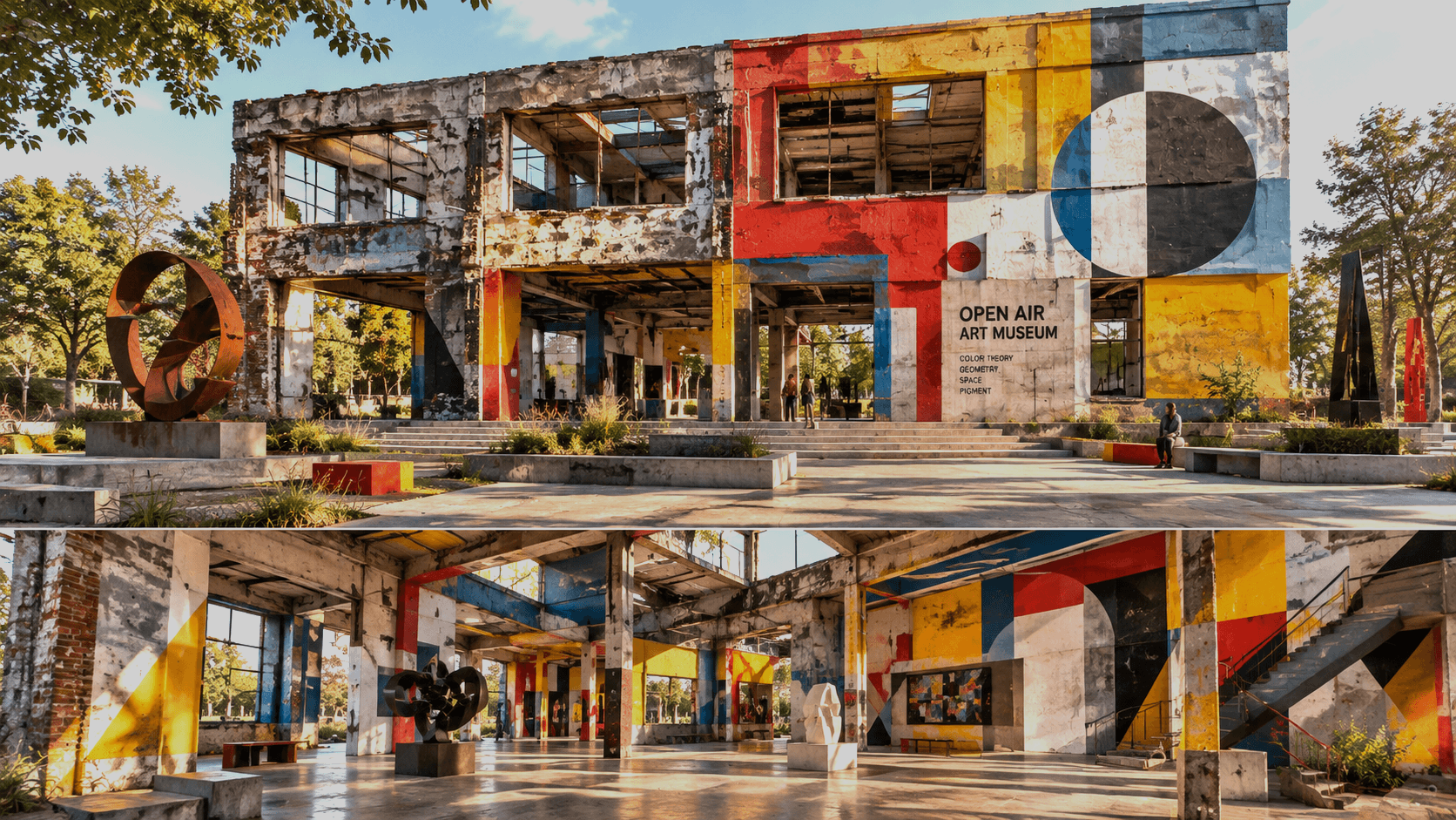
In the modern built environment, we have a tendency to treat real estate as a game of numbers. Landlords and developers are often bombarded by product pitches that prioritize "dial for dollars" efficiency over genuine dialogue. This reduces the lived experience of a tenant to a set of KPIs that overlook a fundamental truth: real estate is, first and foremost, a people business and getting the "small" things right matters.
Color is one of those small things with big, visible, immediate impact: capable of shaping how a space is perceived. But it is not a shortcut to a particular mood or a guaranteed lever for performance. To use color well, property teams need to understand its history, its cultural context, and how this pigmented-force that shape how people who live and work in the spaces they manage feel in the space.
From the prism to the person.
Color theory developed along two influential paths. In the seventeenth century, Isaac Newton used a prism to show that white light separates into a spectrum of colors. His work helped establish a scientific account of color as a property of light. However, the bridge between physics and psychology was built more than a century later. Johann Wolfgang von Goethe in Theory of Colours, published in German in 1810 and in English in 1840, focused on how people experience color—how perception, contrast, and context shape what the eye sees. Goethe’s explanations did not replace Newton’s account of optics, but his interest in human perception helped keep the emotional and experiential dimensions of color in view. His work helped to establish that color is not experienced in isolation. Johannes Itten and the Bauhaus movement shifted the conversation from "what color is this" to "color relations." They introduced the concept of color contrast and harmony, teaching us that colors do not exist in isolation. A deep blue feels different when paired with a clinical white than it does when paired with a warm ochre. Under particular lighting, beside other materials, at a certain scale, and within the routines and memories people bring to a space this historical shift taught designers that the environment is a holistic emotional experience, not a collection of individual paint chips. A pale wall in a sunlit lobby can feel very different from the same paint in a dim corridor.
Solving the experience equation: color, mood and space culture.
If the Bauhaus taught us about harmony, modern environmental psychology teaches us about impact. Color directly influences the endocrine system and the autonomic nervous system, triggering physiological responses that dictate mood. This creates what we call space culture: the collective emotional atmosphere of a building. A lobby drenched in sterile, high-contrast greys and whites may signal efficiency and professionalism, but it can also trigger anxiety or a feeling of coldness, subtly telling the visitor they are a guest in a machine, not a human in a home. Conversely, the strategic use of biophilic greens or soft, warm neutrals can lower cortisol levels and encourage a sense of belonging.
When we ignore the emotional resonance of color, we are essentially ignoring the "lived experience" mentioned earlier; designing for lease, not for life.
A striking lobby may photograph well yet feel unwelcoming to residents. A palette that looks sophisticated in a rendering may be difficult to maintain or may not work for people with visual impairments. A brand-led design may express a company’s identity without reflecting the community’s. Still this does not undermine the business case for placemaking, if anything it underscores just how much how people experience a building matters.
A coherent sense of place strengthens a building’s identity. Welcoming shared spaces may encourage residents to use amenities, interact with one another, and feel more at home. These while reasonable goals are not automatic outcomes. To be clear, color alone cannot guarantee higher retention, occupancy, or revenue. However it can play an outsized role, compared to cost, in shaping service expectations, pricing, maintenance, safety, and the quality of the overall experience. While it may seem "soft" compared to HVAC efficiency or smart-lock integration, color theory has a hard impact on the bottom line. Real estate performance is often measured by retention, but retention is an outcome of satisfaction:
- Occupancy and First Impressions: In a competitive market, the "vibe" of a space is the first thing a prospect feels. A space that utilizes color to evoke warmth and safety reduces the friction of the leasing process.
- Tenant Wellness and Retention: Long-term occupancy is driven by how a person feels when they wake up in their space. Colors that promote circadian rhythm alignment and mental calm reduce tenant burnout and increase the likelihood of lease renewal.
- Brand Equity: For commercial landlords, the color palette is a silent communicator of brand values.
A space that feels curated and intentional signals a higher level of management care, supporting premium perceptions. By starting with human psychology, we stop asking leading questions and start uncovering solutions that not only fill a unit, but to cultivate a space want to inhabit. Understand what makes a place work for the people who live there. Identify who uses each space, when they use it, and what they need to do there. Look at how people move through the building, where they pause, gather, or avoid. Inquire about comfort, and usability. Test in context then adjust based on what you learn. Recall that remarkable egg shell white? Asked no one, ever. Remember that when next you're pitched a product and let it paint the dialogue landscape.
Q+A
How should a property team choose a palette?
Start with the people who use the space and what they need from it. Consider the building’s identity, existing materials, natural and artificial light, accessibility, durability, and maintenance.
How can we tell whether a design change helped?
Combine resident feedback and observations of space use with relevant operational measures. Compare results over time, note other changes that may affect them, and use the findings to improve the design.
How do I balance "trendiness" with timeless color theory?
Trends (like "Millennial Pink" or "Industrial Grey") are cyclical and can make a property feel dated quickly. To ensure long-term performance, use a foundation of timeless tones that evoke stability and comfort, and introduce trendy colors through "moveable" assets like furniture, art, and accents. This allows the space to evolve without requiring a full repaint.
Can color theory really compensate for poor architectural design?
Color cannot fix fundamental structural failures. It can mitigate some negative effects, such as using light colors to make a cramped room feel larger. It can also transform a technically correct space into an emotionally resonant one.
What is the first step in applying this to an existing portfolio?
Start with an audit of the lived experience. Instead of looking at occupancy spreadsheets, walk through the space and ask: "What is this room telling me to feel?" If the answer is "nothing" or "cold," you have a prime opportunity to improve performance through a strategic color intervention.